Discover how to create a responsive website that adapts to different screen sizes and devices. This concise guide takes you through the process of structuring HTML markup, applying responsive CSS styles, and adding interactive elements with JavaScript.
Introduction: In today's digital landscape, having a responsive website is crucial for delivering a seamless user experience across different devices. This comprehensive guide will walk you through the process of building a responsive website using HTML, CSS, and JavaScript. From structuring the HTML markup to styling with CSS and adding interactivity with JavaScript, you'll learn how to create a website that adapts and looks great on desktops, tablets, and mobile devices.
Prerequisites: To follow along with this guide, you should have a basic understanding of HTML, CSS, and JavaScript. Familiarity with HTML tags, CSS selectors, and JavaScript syntax will be beneficial.
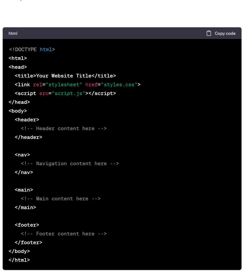
1. Planning and HTML Markup: Start by planning the structure and content of your website. Identify the key sections, such as header, navigation, main content, and footer. Create an HTML file and set up the basic structure using HTML5 semantic elements. Here's an example:
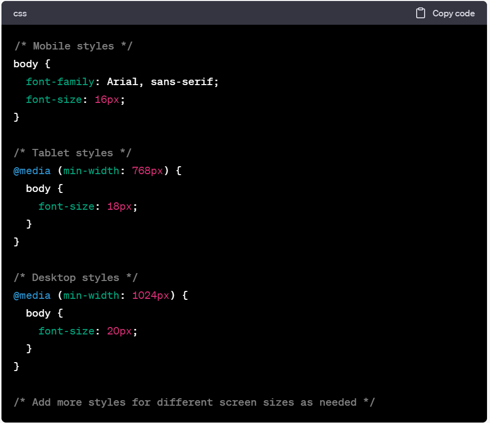
2. Responsive CSS Styling: Next, create a CSS file (styles.css) and link it to your HTML file. Use CSS media queries to apply different styles based on the screen size. Start with a mobile-first approach, applying styles for small screens and gradually adding styles for larger screens. Here's an example:
3. Responsive Images and Media: To ensure images and media adapt to different screen sizes, use CSS properties like max-width: 100% and height: auto. This allows images to scale proportionally. Additionally, consider using CSS frameworks like Bootstrap or CSS grid systems to create responsive grid layouts for your content.
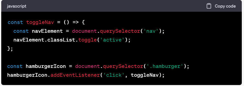
4. JavaScript Interactivity: Enhance your responsive website with JavaScript interactivity. For example, you can create a responsive navigation menu that collapses into a hamburger icon on smaller screens and expands on larger screens. Here's a sample JavaScript code:
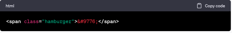
In the HTML, add the following code for the hamburger icon:
5. Testing and Optimization: Test your website on different devices and screen sizes to ensure it displays correctly and remains user-friendly. Use browser developer tools to simulate various screen sizes and debug any issues. Optimize your website's performance by minifying CSS and JavaScript files, compressing images, and implementing caching techniques.
Project: Building a Responsive Portfolio Website As a hands-on project, consider building a responsive portfolio website to showcase your work or skills. Implement a responsive grid layout to display your projects, use media queries for optimal image display, and add interactivity with JavaScript for smooth navigation and transitions.
Conclusion: By following this step-by-step guide, you've learned how to build a responsive website using HTML, CSS, and JavaScript. Remember to plan your website structure, apply responsive CSS styles, optimize media for different screen sizes, and add interactivity using JavaScript. With practice and experimentation, you'll master the art of creating websites that look and function beautifully across all devices. Happy coding!
Meet Frank Thompson, the founder of an inspiring tutorial blog. With a passion for education and a commitment to making learning accessible, Frank empowers learners worldwide. Through comprehensive tutorials, step-by-step guides, and expert insights, he helps individuals unlock their potential and achieve success.
Technology plays a crucial role in shaping our society, and as the world becomes more aware of the environmental challenges we face, sustainable technology has emerged as a key solution to create a greener future. This article explores the innovative advancements in sustainable technology and their impact on the environment, economy, and society.
In recent years, 3D printing has emerged as a groundbreaking technology with the potential to revolutionize various industries, including healthcare and manufacturing. This innovative approach allows the creation of three-dimensional objects from digital models, offering unprecedented flexibility and customization.
In today's digital age, personalized user experiences have become a crucial aspect of successful online platforms. Users expect tailored content, recommendations, and interactions that cater to their specific needs and preferences. This is where machine learning, a subset of artificial intelligence, plays a significant role.